
EXCLUSIVE CONTENT
Complimentary Content and Design Support for Instagram Followers!
YOUR DESIGNER
Paige Gray, BA ID

How to Paint Trim for a Subtle Yet Stylish Update
Why Choose Coloured Trim?
Injects Personality: Coloured trim adds a unique touch to your home, creating a more dynamic environment without the need for bold wall colours.
Elevates Neutral Spaces: For homes with neutral walls or muted tones, painted trim is a way to introduce color while maintaining a sophisticated, understated look.
Creates Visual Contrast: Coloured trim can define architectural features and add a layer of visual interest without overpowering the room.
When Is ColoUred Trim Right for Your Home?
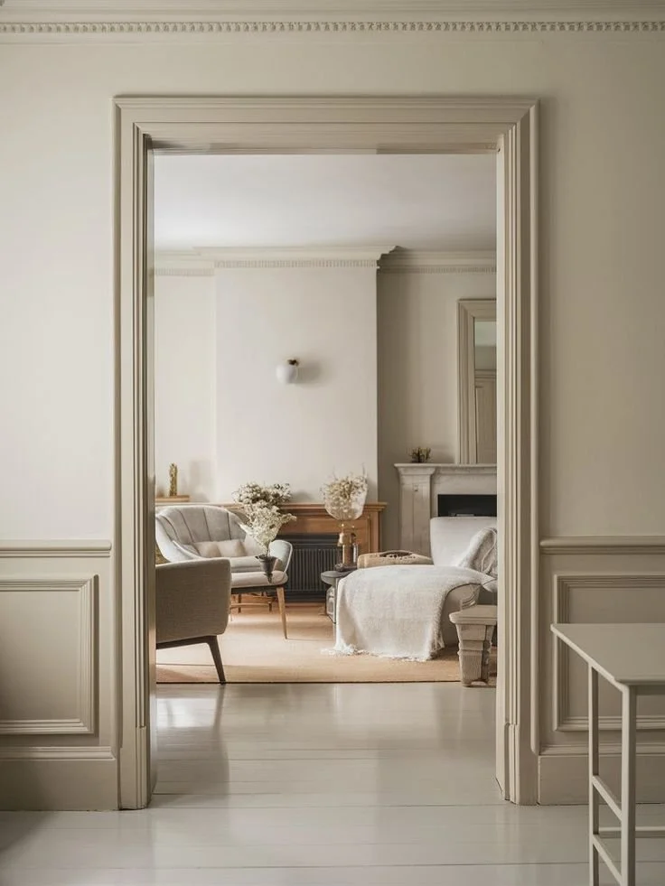
Neutral Walls: If you have neutral walls in shades of white, gray, beige, or soft pastels, adding colored trim can provide a refreshing contrast.
Open Floor Plans: Painted trim helps define spaces within an open-plan layout, creating visual borders that help balance and organize the space.
Minimalist Aesthetic: If you prefer a minimalist or Scandinavian look, using soft, muted tones for trim can enhance the design without overwhelming the simplicity.
Period Homes & Character Spaces: In older homes or rooms with unique architectural details, painted trim can accentuate historical features while bringing them into the present.
How to Choose the Right Trim Color
Neutral Trim ColoUrs (Soft & Subtle)
Perfect for those who want to maintain a serene atmosphere while adding a hint of color.
Warm Beige or Taupe: Ideal for warm-toned walls, this trim color will harmonize with most neutral palettes without feeling jarring.
Soft Gray or Charcoal: A sophisticated option for cool-toned walls (like light gray or blue). Gray trim offers a modern, calming effect.
Warm White or Cream: If your home features off-white or cream walls, matching your trim in a slightly warmer shade will create a soft, elegant contrast.
Bold Trim ColoUrs (For a Stronger Statement)
Great for clients who are ready to embrace color but still want it to feel sophisticated and intentional.
Navy Blue: Works wonders with warm neutrals like beige or taupe, adding depth and richness. Perfect for spaces that could use a touch of elegance.
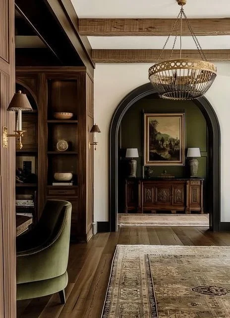
Forest Green or Olive: For a deep, earthy feel, green trim pairs wonderfully with light, airy neutrals or white walls, offering a timeless and organic vibe.
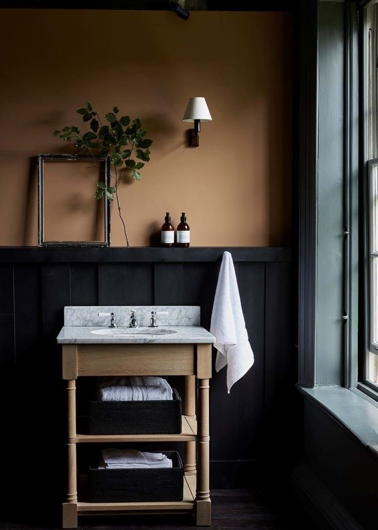
Charcoal or Black: For a darker, almost industrial look, this colour complements light gray or white walls and is great for creating a modern, moody atmosphere.

Soft Pastels (Playful Yet Subtle)
Soft pastels add just enough colour to make the space feel light and airy, without overwhelming the senses.
Soft Mint or Sage Green: Fresh and rejuvenating, mint green trim pairs well with neutral grays and whites, bringing a sense of calm.
Blush Pink or Powder Blue: Ideal for bedrooms or living rooms, blush pink trim complements neutral whites or light grays for a gentle, welcoming tone.

Tips for Choosing Trim Color Based on Room Function
Living Rooms & Dining Rooms: These spaces benefit from deeper, richer tones like navy, forest green, or charcoal. It creates warmth and defines the space without overpowering it.
Kitchens & Bathrooms: If you want to go bolder, try a soft mint, navy blue, or even a light green. These colours work especially well with white or light gray cabinets and tiles.
Bedrooms: Soft pastels, muted grays, or light navy are ideal in bedrooms for a calming, restful atmosphere.
Entryways or Hallways: Darker colours, like charcoal or black, can help accentuate architectural details and give your entryway a more defined, dramatic look.
Need Help deciding on TRIm for your space?
EXCLUSIVE CONTENT
Complimentary Content and Design Support for Instagram Followers!
YOUR DESIGNER
Paige Gray, BA ID